


C2E2 in Chicago, Xencelabs Artist Spotlight & more
And a few thoughts on the great movie poster artist Drew Struzan.

Quick housekeeping: Gonna be in Chicago this coming weekend, April 11-13th? Looking for a reason to get rid of that money burning a hole in your pocket?? Have I got news for you! I will be at the annual Chicago comic con, C2E2, all day Saturday at the National Cartoonists Society booth!
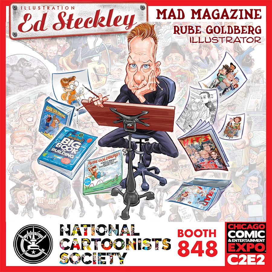
I’ll be there all day selling & signing books, doing personal commission caricatures & drinking lousy McCormick Place coffee!
Stop on my, get some books & a drawing, and say Hi!
Psst: Let me know if you’re a subscriber to this Substack & I’ll throw a 15% discount your way! No foolin’!
Can’t make it to C2E2? Click here to get customized books and commissions!

Double Psst: From April 11-13, I’ll be offering a 10% convention weekend discount on all website commissions!
Xencelabs Artist Spotlight Series
Earlier this year I was featured in Xencelabs Artist Spotlight series. Here’s that interview…
If you’re not familiar with Xencelabs (pronounced ‘SENSE-labs’), it’s a relatively new computer input device company, offering pen tablets and displays that’ve quickly risen to the top of the ever growing list of Wacom competitors. and Last year I traded out my trusty, yet severely cracked, Wacom Cintiq Pro 24 for the Xencelabs Pen Display 24. I’m overdue for a review of this machine, and that’s on the to-do list, but for now, I’ll offer this: I really like this device, for a number of reasons.
One seems like a relatively minor feature, but one I really like: subtly etched (textured) surface. It’s not a visible texture, so no obscuring of the screen, but the result is a much more of a realistic feel to the drawing process than drawing on slippery smooth glass. What’s that matter? Well, It’s probably as close as you can get to the feel of drawing on paper. The surface, along with the felt-tip nib option I opt for, turns out to be way more of a selling point then I’d have imagined.
I read a review that noted the slight texture also cuts down on any glare, but then again, so does not having a window or bright light right behind you when you’re drawing. But I digress...
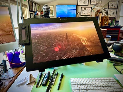
Also, there’s no fan in this device. Though I never gave the running fan on the Wacom much thought, the absence of that tiny bit of whrrrrring, clicking on and off, just makes for a better overall experience. Plus, no fans means no more having to clean out intake/outtake vents to prevent overheating. This machine gets warm, but as a result of whatever heat displacement they’ve got going on in this thing, not hot enough to be any sort of annoyance, at least IMO.
Movie Poster Cogitating
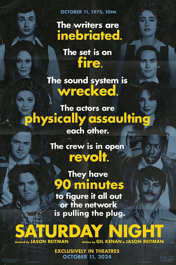
I recently saw the move Saturday Night, which loosely chronicles the 90 minutes or so leading up to the premier of Saturday Night Live, back in 1975.
For fans of SNL, this movie is pretty fun, especially given how spot-on the actors portraying the original Not Ready for Prime Time Players are. I’m convinced, whatever the dude who played Chevy Chase in the movie goes on to do after this movie will forever be seen by me as… Chevy Chase, from ‘that SNL movie’.
Anyhoo, I recently became aware of an apparently alternate, or second, poster for this film, and then it got a little more interesting.
The poster is a collage of caricatures of the cast, Obviously a throwback to a bygone era where movie studios actually sought out the top cartoonists and illustrators of the day to create elaborate caricature based vignettes to sell their latest features.
In addition to illustrated Mad magazine ‘style’ posters now reading as ‘dated’, the evolution of how the studios are run has also played a part. The days when studio heads, directors and producers had appreciation for the art and artists, subsequently given a wide berth to ‘do what they do’ have been replaced by an era of individual actors (or worse, their agents!) having veto power on their likenesses and placements on promotion materials. This alone is enough to opt for cheap, ‘orange & teal’ Photoshop mish-mosh collage nightmares that can be edited and reworked easily in-house to appease everyone.
I’ve been subject to this myself- not long ago I did a movie poster for the smallest budget box office bomb you ever did (not) see, and even THAT had to pass the approval of not only the largely teenage cast, but the teams representing each. For that poster, one particular member of the cast was a kid who made goofy faces the whole movie (and got the most laughs), and was the one I had the most trouble getting approval for. His reps/agents/parents/whoever had me go back and water this kid’s face down more and more to where it’s barely a caricature.
This is one of the main reasons the great poster artist Drew Struzan** all but walked away from that side of the business.
When Struzan painted a poster for Raiders of the Lost Ark, it was primarily George Lucas and Steven Speilberg who had veto power. They knew what they had in Drew (and Richard Amsel, who did the original marquee poster art), choose from a few designs submitted, and had the wisdom to let him just go home and do it.
The poster showed up eventually, finished, they signed off on it, everybody was happy.
By the time it came for Drew to paint the poster for Indiana Jones and Kingdom of the Crystal Skull, that whole process had changed and he was now subject to the dreaded ‘art by committee’ approach I just spelled out, with nit-picky revisions by a team of agents and artists directors, all wanting to put their stamp on everything, pushing Drew over the edge to go into semi-retirement. (Not to say he hasn’t created some incredible movie posters since- a dude’s gotta eat! The Harry Potter images come to mind, but they’re much fewer and far between.)
Which brings me back to the Saturday Night poster:
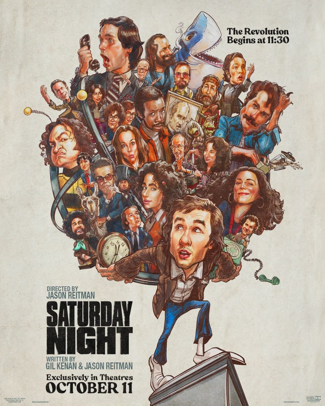
When I saw that, I thought how cool it was to have a poster done in this style, but I noticed there was no signature. I didn’t recognize the art, though it looks to at least have influences of people I originally thought had painted it.
After a pretty exhaustive search, it turns out it was the one and only Drew Struzan who came up with this image!
Clearly art directed to mimic the look and feel of another time, but some of Drew’s tell-tale trademarks are there, you just have to look closer.
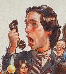
The techniques used are especially apparent in some of the more prominent faces.
But… other elements are very much NOT Drew. Look at the top of the phone the Chevy Chase character is holding. Looks like maybe it was Photoshopped- why is it all stretched and contorted??
This body, with the oversized hands and goofy shoes gives me the impression he was instructed to ‘Make it more Jack Davis-like’.
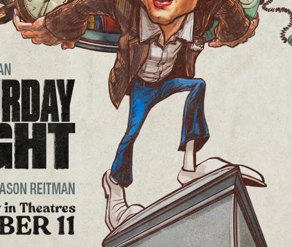
Either that, or another artist was called in to do the bodies. I have a hunch this was the case, as Drew knows how to draw feet, plain & simple. Anyone who knows anatomy can pull off oversized, cartoony hands & feet while still making them believable. Or at the very least, make them work in the image, which these do not.
Maybe I’m wrong, but whatever, finding info on any of this online ain’t easy so far!
If anybody has any insight to any of this, I’d love hear it!
**Update…
I just heard from
that Drew Struzan is no longer painting, so I’m completely off in my assumption that he did this poster.Here’s an article Mike sent about this…
Thanks, Mike!!
Not only was this a fascinating article about the rigors of the artist's life and struggles, it was a thrill to finally meet you face-to- ... uh ... well it was wonderful connect a face and voice to your name and work. Thank you so much for this and the peek into the caricature artist.
Sadly, Struzan isn't doing any work anymore so definitely didn't do this.
Artist Drew Struzan victim to Alzheimer’s, can no longer paint
By John Freeman on March 28, 2025
https://downthetubes.net/artist-drew-struzan-victim-to-alzheimers-can-no-longer-paint/